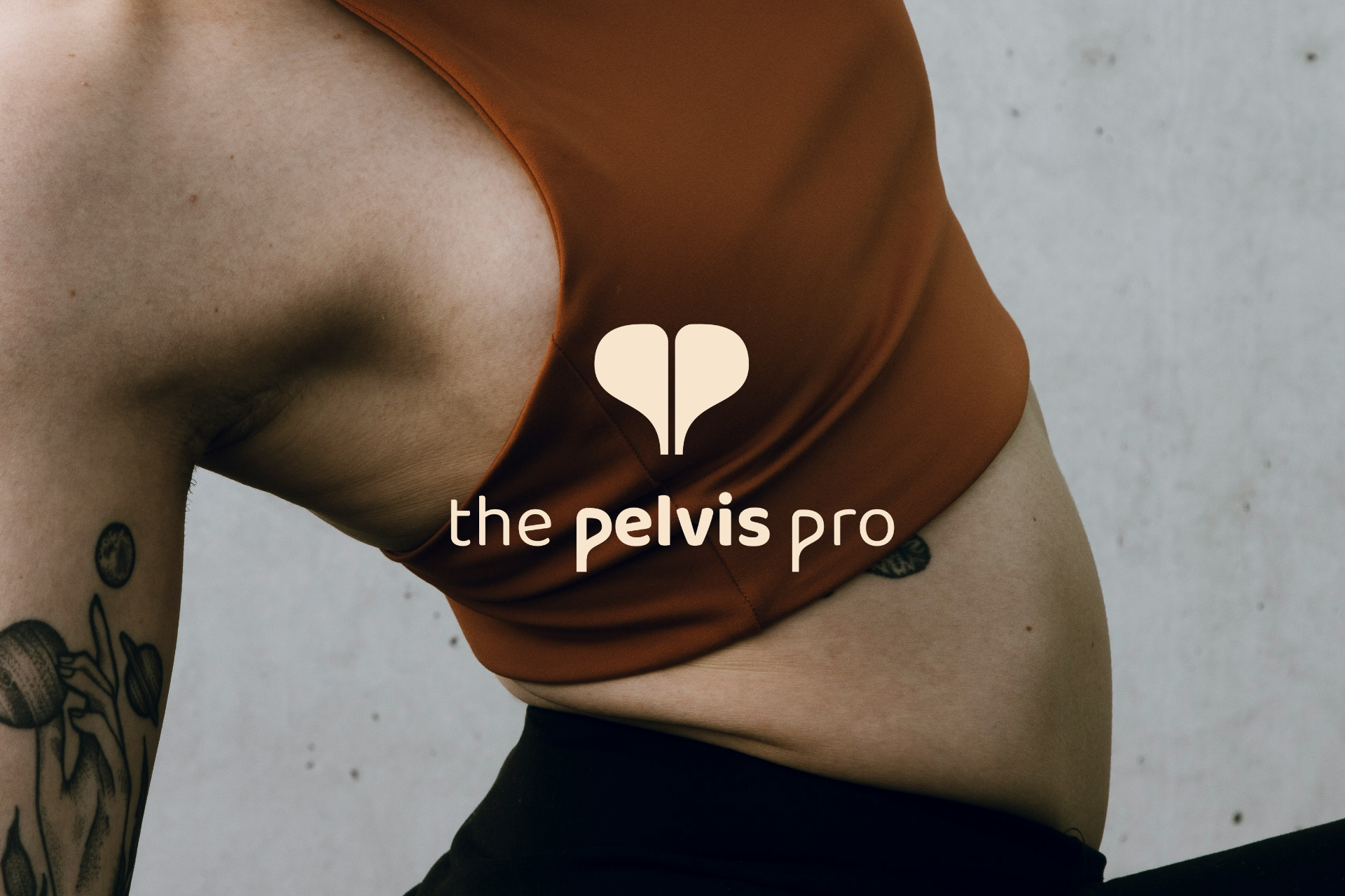
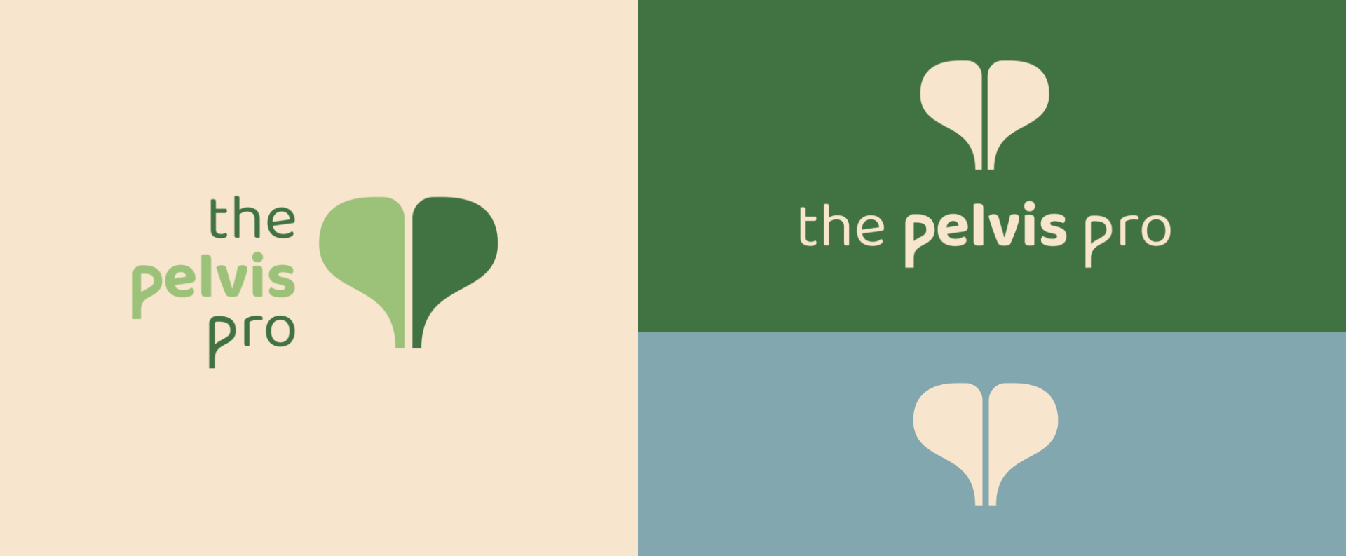
Because the space already established so much personality, its warm tones, playful murals, and confident energy, our job was to create a brand that lived seamlessly within it. We anchored the identity in a custom double-P monogram that subtly mirrors the shape of a pelvis, giving the brand a clever visual wink without feeling clinical or literal. The supporting palette pulls directly from hues already in the studio, making the identity feel naturally integrated with the physical environment.
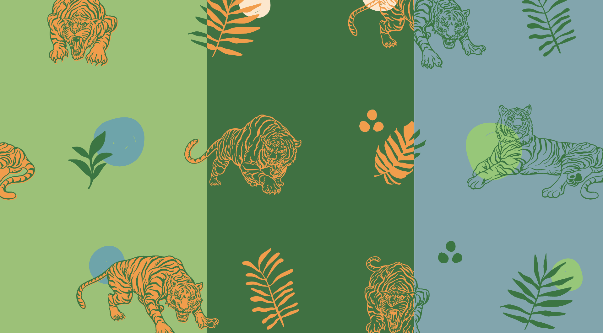
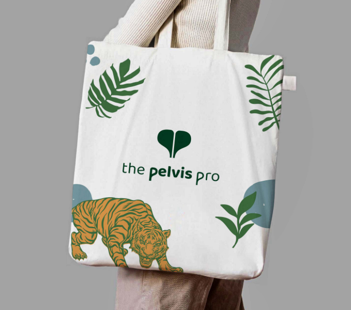
From there, we expanded into a full visual system: clean typography with a bit of edge, a custom pattern built from the monogram, and image direction that balances expertise with approachability. The result is a brand that’s fresh and friendly but still has that unexpected, slightly rebellious spark— a perfect match for a practice that’s redefining what pelvic floor care can feel like.