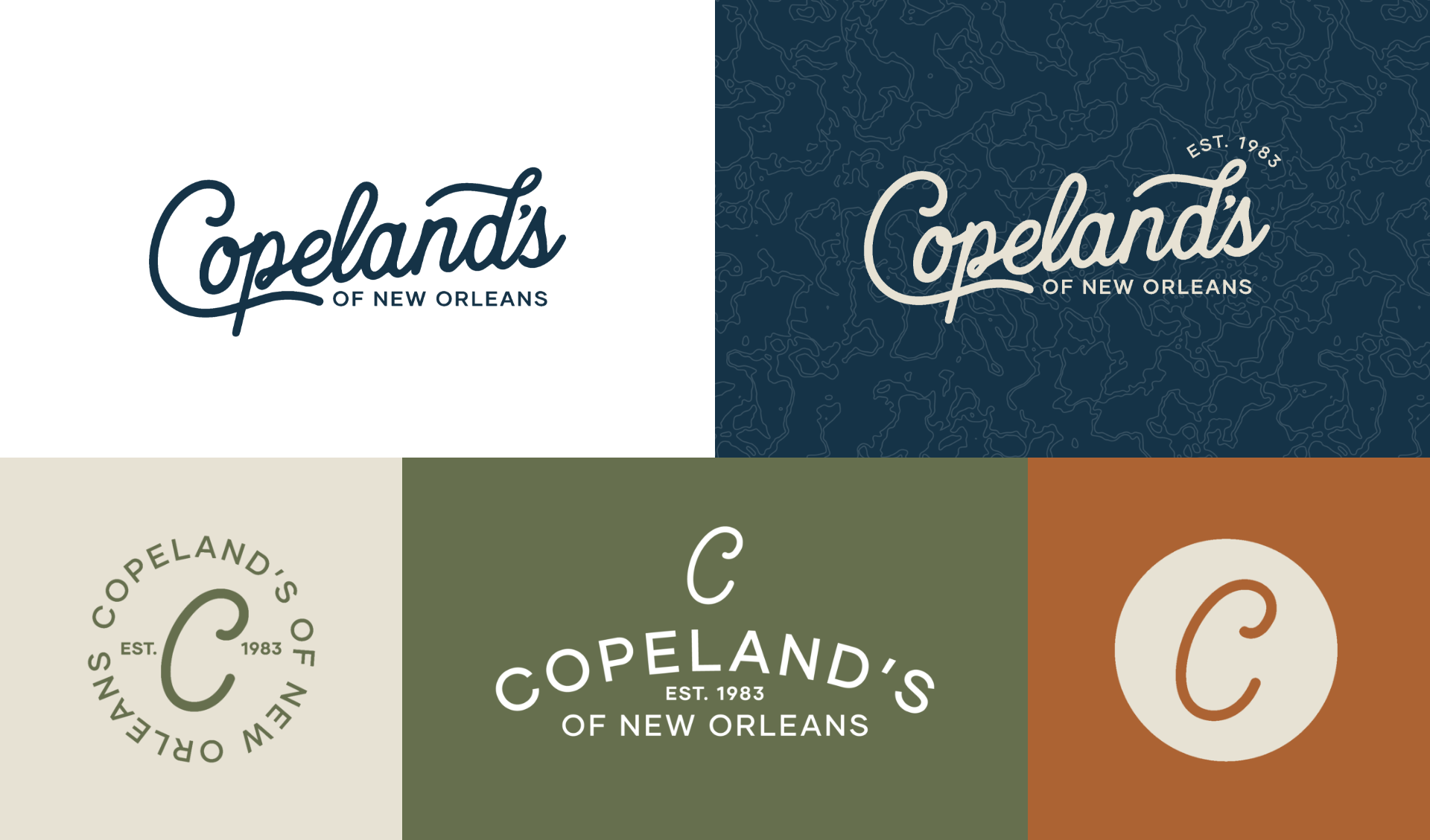
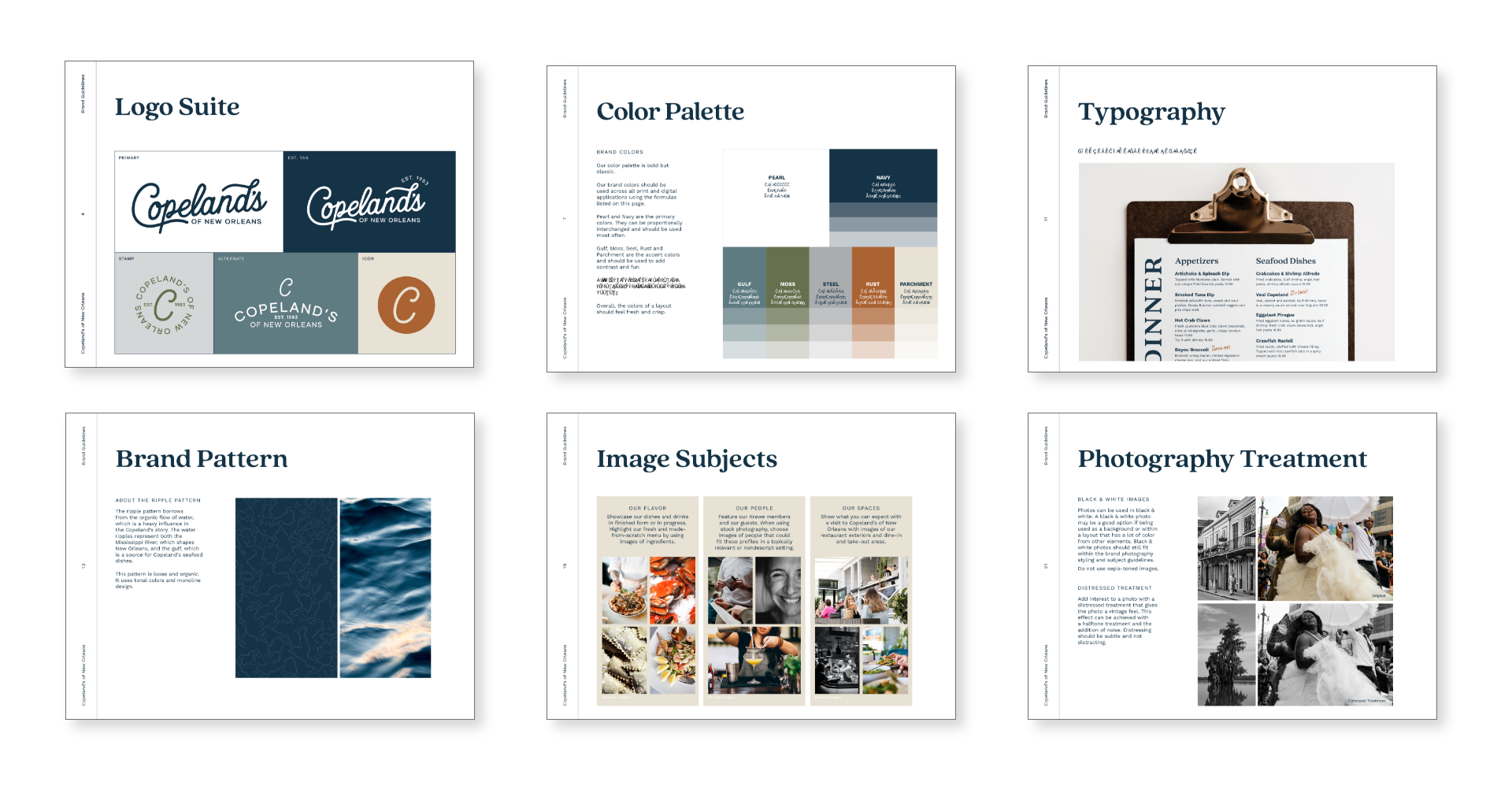
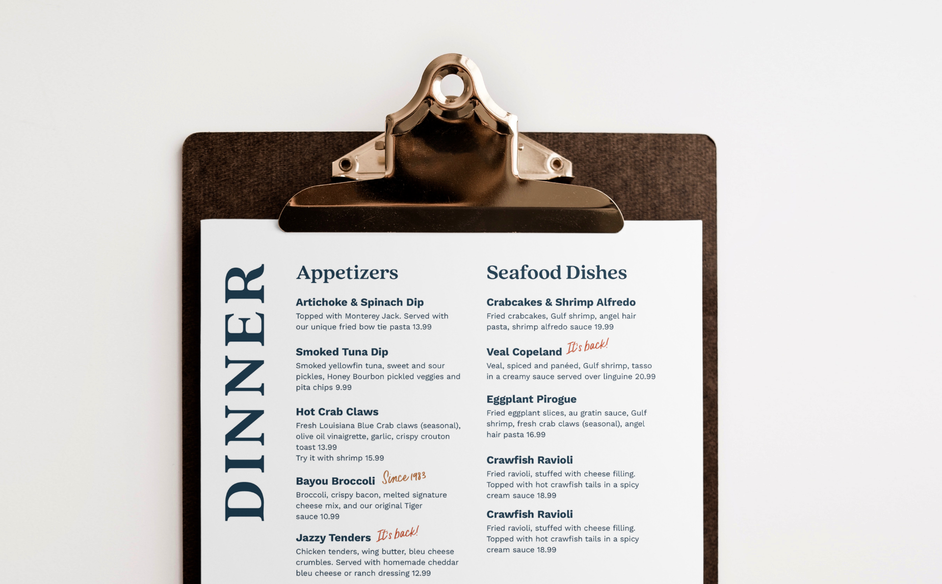
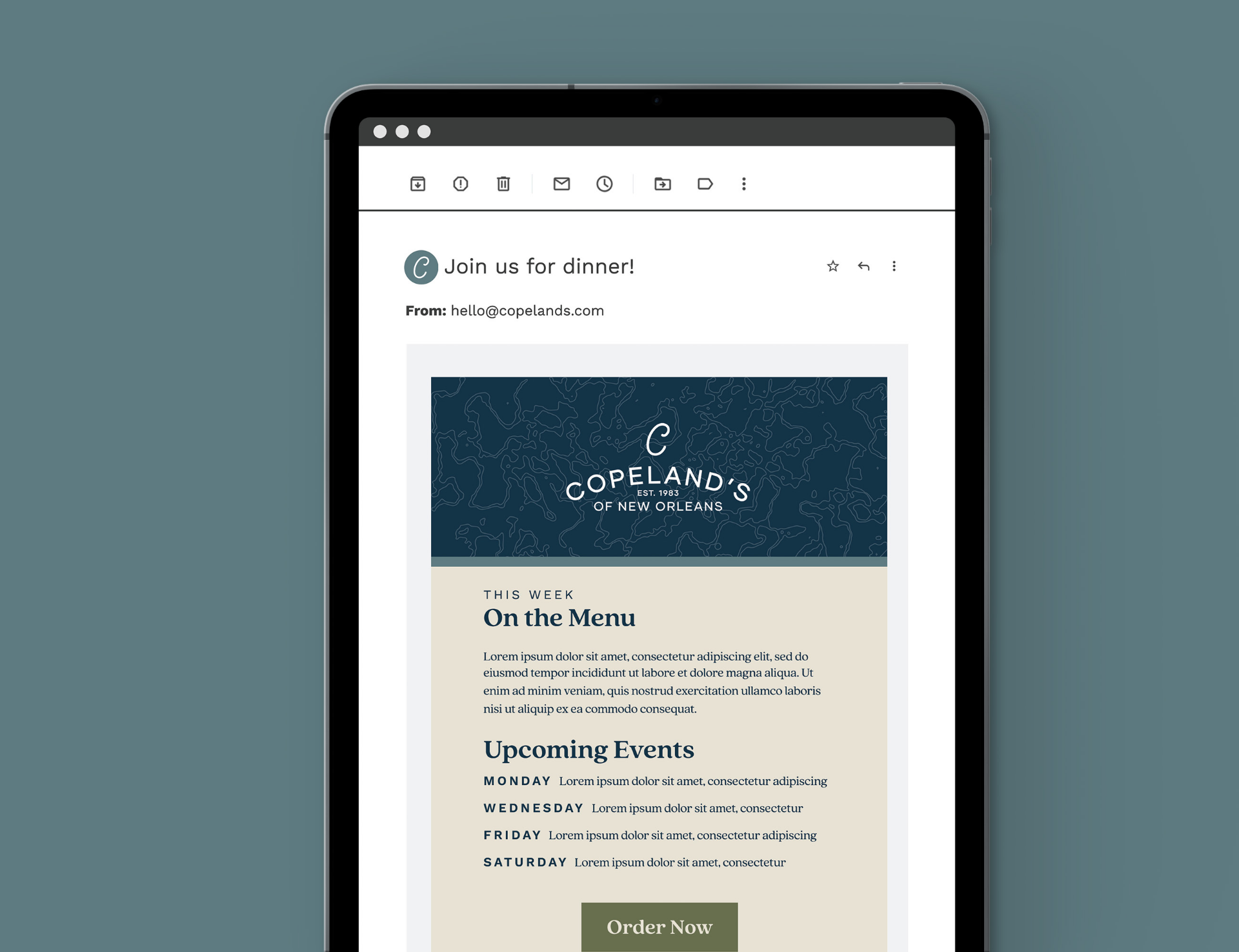
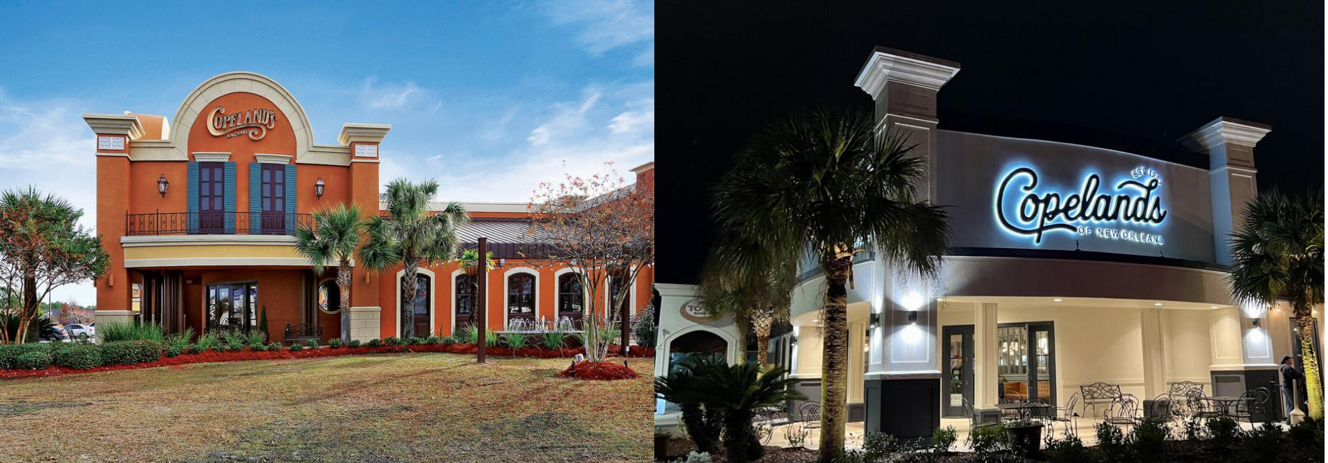
We started with research, digging into Copeland’s audience and competitive landscape to understand how the brand could evolve while staying true to its Southern hospitality. The updated identity strikes a balance between tradition and today: a warmer, more casual handwritten script nods to the original mark, paired with an elevated color palette, approachable typography, and fresh photography direction. The result feels relaxed yet refined— a timeless brand refresh ready to welcome both longtime guests and a new generation of diners.