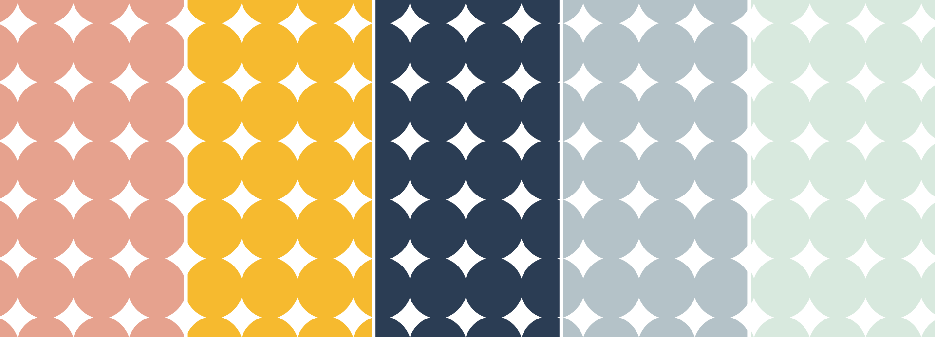
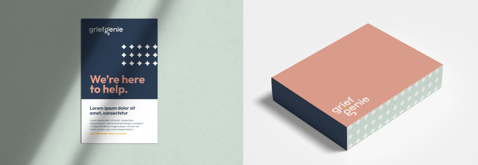
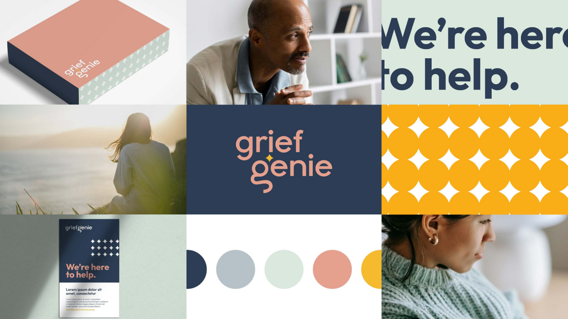
We began with a deep discovery process to understand the brand’s audience, landscape, and emotional tone. From there, we built a clear brand voice that could speak with empathy and calm authority. The visual identity carries that same warmth and clarity, featuring a custom “G” icon that subtly references a genie and a guiding star, both symbols of light and direction during difficult times. A soft color palette, modern typography, and balanced layout system complete the approachable yet professional brand.